Sunday Musings - Wayne England: Baroque, Brutal, Beautiful


The Artist Who Made Skulls Look Really Cool
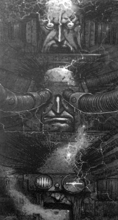
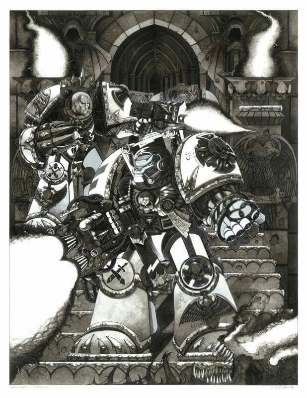
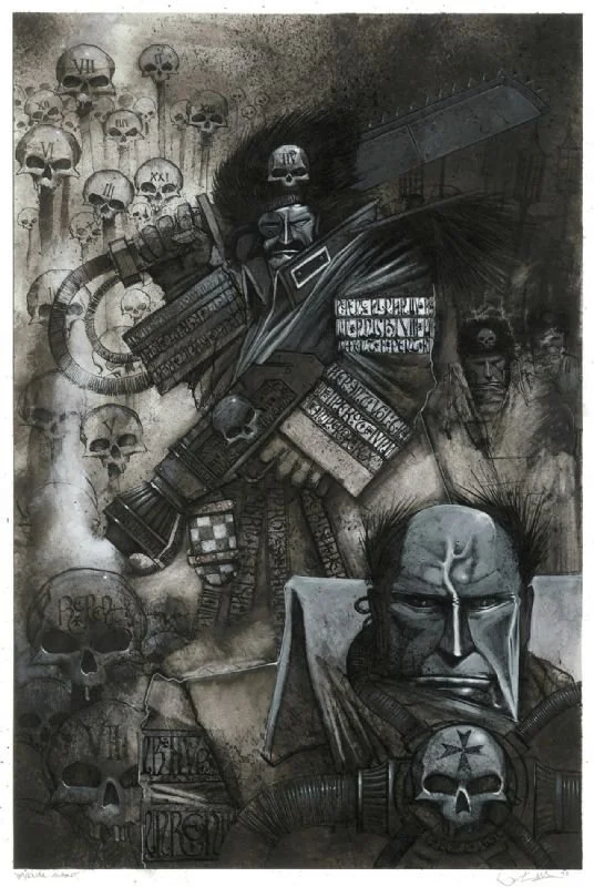
Warhammer has always had more than it's fair share of fantastic artists, Mark Gibbons, Ian Miller and of course John Blanche all spring to mind. But, as much as I adore the work of all of those who built the look of Warhammer, I always return of Wayne England as being the look of "My Warhammer". During the time of more kinetic, more saturated and more exaggerated styles in both the miniatures and art, it's the work of Wayne England that stands out as what Talisman is, what Warhammer Quest looks like. He had a style so distinct you could shave with it as it instantly stood out. It was bold, using cartooning in just the right amounts and knew how to make armour and furs look really lived in.
His work was that of a medieval 2000AD cover by way of a dark ages metal band. Layers of detailing that rewarded the eye for taking the time to explore and often an impractical amount of skulls. His work for both GW and in Magic The Gathering is signature art in it's own right whether it was beautifully colour or starkly desaturated with jagged steel, spikes, more skulls and sinister embellishments (often skulls) created characters to imagine tales and games about. Everything had a sense of heavy weight of years about it, and his 40k creations were undoubtedly some of the best examples of the neo-gothic styles of the Imperium with some truly weird Tyranid designs) that polished 2nd Ed up no end.
Seriously, if Warhammer had a “Department of Excessive Skull Usage,” England would’ve been its CEO.
His work defined the mid to late 90s, though he began producing art as far back as the late 80s with some Deathwing work. Nothing was soft or uncertain about the designs, instead a snarling yet often comedic take that dripped with exaggerated menace. He took that style and evolved it in Magic: The Gathering where his artwork for artifact-heavy cards carried the same mechanical intricacy as his Warhammer pieces. His style made even mundane items look mystical—every sword seemed like it had slain a thousand foes, every shield looked like it had deflected the wrath of gods. His Dwarfs and Goblins were always true favorites of hime, and I've always wished he could have drawn a Goblin strip in Warhammer Monthly or Inferno!
England's passing in 2016 at only 56 was a loss felt the community deeply. Whilst the in-house style had moved away from the kinetic look he brought to the forefront, his work were the building blocks that built the the worlds we love to blow up. It was raw, dramatic, utterly iconic and never bland. Whether capturing the dread majesty of Chaos or breathing life into a lone warrior’s struggle, England didn’t just illustrate fantasy—he made it feel real
So, here’s to Wayne England—the artist who made Warhammer even more Warhammer, the king of skull motifs, and a legend who turned ink into worlds.
As always, I remain
Adam


